Navigating the Process Intelligence Dashboard
The Worksoft Process Intelligence Dashboard provides comprehensive view of your business processes generated from multiple data sources in real time, and it calculates the value of process automation and optimization.
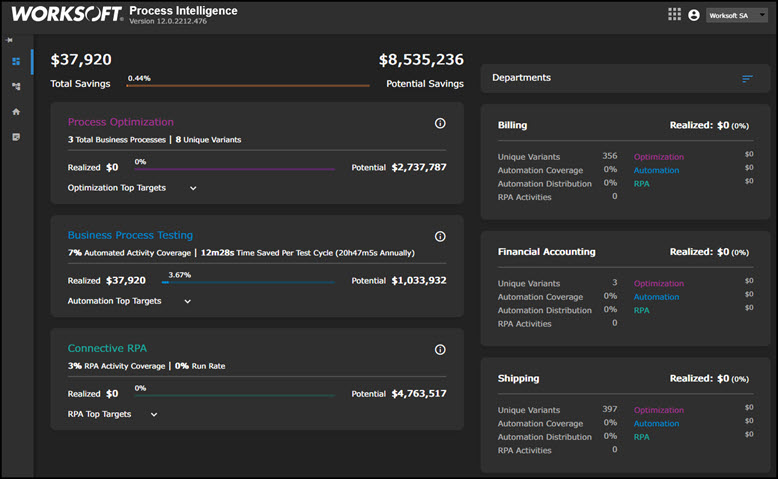
On the left side of the Process Intelligence Dashboard, you are able to view the following modules:
- Process Optimization
- Business Process Testing
- Connective RPA
Process Optimization Module
From uploaded process mining and Capture data, the Process Optimization module tracks efficiencies and calculates the following components:
|
Component |
Description |
|
Total Business Processes |
Total count of unique business processes across the entire data set |
|
Process Variants |
Total count of all variants across all processed data |
|
Realized Savings |
Annual gained efficiencies detected between multiple process mining data |
|
Potential Savings |
Annual projection of process savings across the activity frequency and costs associated with all processes uploaded from process mining and Capture data |
Optimization Top Targets Graphs
Click the Optimization Top Targets drop-down button to view the following graphs.

|
Graph |
Description |
|
Top Scattered Variants |
Top business processes with the highest number of unique variants are displayed. These processes should be investigated to achieve efficiency. A high number of variants could be a sign of poorly documented processes. |
|
Lost Productivity Time Distribution (est.) |
Top business processes with the highest amount of time spent outside of the most common variant are displayed. These processes should be analyzed for time delays occurring outside of the desired process flow. |
|
Business Process Duration |
Top five business processes with the longest average time are displayed. |
Business Process Testing Module
The Business Process Testing module summarizes the current test automation landscape by highlighting coverage and prioritizing targets for additional automation.
|
Calculation |
Description |
|
Automated Activity Coverage |
Percent of automated activities compared to their manual counterparts |
|
Time Saved Per Test Cycle |
Total test time for all unique tests The annual calculation multiplies the time by test frequency. |
|
Realized Savings |
Sum total of unique activity costs per business process for only test automation data that is multiplied by the annual test frequency calculated by each department |
|
Potential Savings |
Sum total of unique activity costs per business process across all data sources that is multiplied by the annual test frequency calculated by each department |
Automation Top Targets Graphs
Click the Automation Top Targets drop-down button to view the following graphs.

|
Graph |
Description |
|
Top Manual Activity Targets |
Manual activities with the highest cost and frequency are displayed. These activities should be considered for test automation. |
|
Manual Activity Cost vs Manual Activity Coverage |
Within the same business process, the activity cost of all activities and variants are plotted against the percent of manual activities. Business processes with a high manual cost and high percentage of manual work should be considered for test automation. |
Connective RPA Module
The Connective RPA module summarizes your current process automation landscape by highlighting coverage and prioritizing targets for additional automation.
|
Calculation |
Description |
|
RPA Activity Coverage |
Percent of RPA activities compared to all activities |
|
Run Rate |
Success percentage of RPA runs over the last 30 days |
|
Realized Savings |
Realized annual costs associated with RPA activities per business process |
|
Potential Savings |
Five percent annual projection of process savings across the activity frequency and costs for all processes uploaded from process mining and Capture data |
RPA Top Targets Graphs
Click the RPA Top Targets drop-down button to view the following graphs.
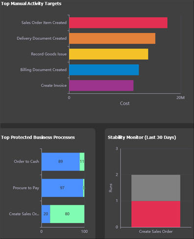
|
Graph |
Description |
|
Top Manual Activity Targets |
This graph displays manual activities with the highest cost and frequency. These activities have the highest potential for return on investment. |
|
Top Protected Business Processes |
This graph displays manual processes being compared with test automation coverage. |
|
Stability Monitor (Last 30 Days) |
This graph displays the business processes with the most failures in the last 30 days as a comparison to the total number of runs over the last 30 days. |
Departments Module
On the right side of the Dashboard, the following information is listed in each department:
- Realized savings
- Number of process variants
- Automation coverage
- Automation distribution
- RPA activities
When you click on a department, the Business Process Visualization page opens. For more information, see Navigating the Business Process Visualization Page.
Navigation Pane
The Navigation pane is on the left side of the page helps you navigate to the following pages:
- Dashboard
- Process Analysis
- My Dashboard
- Data Management
The Data Management page is where you will upload your reference table and data. Before you can upload data into Process Intelligence, you must upload a reference table in the XLSX format. For more information, see the following:
- Uploading a Reference Table
- Uploading a Capture into Process Intelligence
- Uploading Process Mining JSON Files into Process Intelligence
- Uploading a Certify Results File into Process Intelligence
- Uploading a Capture from Worksoft RPA Orchestrator into Process Intelligence
- Uploading a BPMN File into Process Intelligence